Sunday, April 17, 2011

Conveyance: Critical Reflection

Clarity
Each composition clearly presents the intended theme. The narratives posted below each image further explain how each composition emphasizes the theme. The entire post is working towards the same theme of conveyance. The explanations ensure that there will not be misinterpretations of the piece’s message. Each image represents a different message but in essence they are all working towards the same concept.

Audience
The target viewer of my blog is my professor and possibly classmates. The blog is not necessarily intended for a client; it is being used as a way to explain the concepts I have learned in this semester and what compositions I have created using the knowledge I have gained. My professor and classmates have a variety of tastes. It is clear to see this by viewing the blogs of my fellow classmates and seeing the diversity in their posts. The concept is explained in an educational tone. The post serves as an explanation on how to utilize images and text in order to convey a concept. The explanations are kept concise to keep readers from becoming bored or uninterested. I tried to use a variety of colors to keep the viewers engaged as well. The concepts are very understandable to all viewers and the explanations in each post further help the viewer gain understanding of them. Each image in this post is created from my interpretation of the word; therefore, it differs from the compositions created by my fellow classmates. If this blog post were a person, it would be an intriguing and creative person that the viewers would want to learn more about.

Purpose
This post is supposed to explain the concept Typographical Conveyance. It is not meant to sell a product or persuade anyone. It is more of an informational post that allows viewers to develop an understanding of the concept explained and give them examples of how it can be shown. The post is narrow enough so that what is included is necessary and nothing could or should be left out.

Thursday, April 14, 2011

Typographical Conveyance

"With visual Media, conveyance is the delivery of meaning or mood from the observed to the observer." (p. 283) -Krause

The purpose of this exercise was to come up with typographic conveyances using a given list of words.

The first word was "BRICK". I first found an image of a brick wall on Google. I then chose a font that was very thick and almost like blocks. I used the eyedropper tool to make the word the color of one of the bricks from the wall. Finally, I added a bevel and emboss effect in order to make the word stick out from the background and make it look more square like.

The second word was "LIGHTLY". I chose to do a simple image for this. I used a very flowy font and chose a light blue for the color. I then used the shape tool to put an light bulb as the dot in the "i". Finally, I added an outer glow effect to drive home the idea of light.

The third word was "PILLOW". I first found an image of a sleeping baby on Google. I used the magnetic lasso tool to outline the baby. I then dragged the baby onto a blank canvas. I added the text "Pillow" in a very rounded font to give it a fluffy effect. I then used the liquify filter to shape the word around the baby's head to make it look like a pillow. I added an inner shadow effect to the text to make it have a softer look. I left everything in this image shades of grey.

The fourth word was "SHRED". I chose a simple font for this image. I then used the line tool to draw white lines through the word repeatedly to make it look like the word itself was being shredded.


The fifth word was "XXL". I started with an image of an oversized man from Google. I used the magic wand tool to get rid of the background and then dragged him onto a blank canvas. I chose a font that is very thick and blockish. I made the "L" larger than the "XX". I placed the "L" on the man's huge stomach to emphasizes that it represents the word "large". Finally I added a drop shadow to make the letters stick out.
The last word was "ATOM". I first chose a simple, yet bolded font. Then, I used the paintbrush tool to draw red dots all over the word. I then added a drop shadow to the dots. Finally, I deleted the text so that all that was visible was the red dots in the shape of each letter. I chose to do this to make it look like the word was actually made up of hundreds of little molecules.

Overall I am very happy with my final products. I believe that each image correctly conveys the meaning of the word. I like that this exercise allowed us to utilize many of the different tools in Photoshop we have learned to use throughout the semester.

Monday, April 11, 2011

Components: Critical Reflection

Connotation
The visual style of this section of my blog is the same as the first section. The background is pink and the headlines and titles are purple. These colors convey a girly theme to represent my personality. The colors in the blog catch the reader’s eyes, accomplishing one of the main goals of the style. The only thing that might be improved upon is the font color of the body of the blog. The light gray color might make it difficult for some to see against the light pink background. Choosing a darker gray would be one way to fix this problem. It would be helpful to get input from others because the style of the blog does reflect my taste and personality. Different audiences may prefer different colors or themes. However, I tried to make sure that each assignment effectively conveyed its own meaning without too much of my preference put into it. For example, in my Color Echo post I followed the exercise instructions by pulling colors from the fruit in the bowl when choosing background and font colors. I avoided using colors that I thought were “pretty” and instead chose colors that helped make the image flow.

Attributes
I am overall pleased with the visual weight, structure, color and presentational style of my blog portfolio. For example, I like that images such as the ones in my Word Portrait post have a white background. When coloring the background is not part of the assignment it is helpful to keep it white rather than transparent in order to keep it from blending into the background of the blog. Linework in my Gestalt Principles and Icons post could be tweaked. The image of the icon I created a good representation of a wrench, however, making the lines a little thicker and steadier would make it have more of a professionally drawn feel. The black background in my icon makes the wrench stick out nicely. As I mentioned before, I tried to stay away from using my favorite colors in every assignment. There is a variety of colors used throughout each component. Although each assignment is not composed using the same colors, overall they fit nicely together in the blog portfolio. By keeping each post in the same format the blog conveys a sense of flow. All of the compositions could be used for several different uses. For example, the image in the Legibility and Text Safe Areas post could be used as an invitation, e-card, poster, etc. The font size in each composition and in the blog body is large enough for the intended audience to read. The fonts in each composition were specifically chosen to convey each given message. I am happy with my choice in fonts for each assignment and the body of the blog.

Placement
Each assignment deserves some attention. There are some that are more complex and may take more time than others. This is shown by how much description is given. For example, the post Second Life Prims seems to have the least amount of writing beneath it. This is because the assignment was to simply create a prim in the Second Life program. There was not much of a deeper meaning other than to experience the complexity of computer simulations. The lines, dates, and titles separating each post are completely necessary. These allow the audience to see where one concept ends and another begins. Each is separated but still follows the same format. All of the images are centered, except for the ones included in the Word Portrait post. These are not centered because there were so many of them it made sense to wrap the text around them. However, in order to maintain the visual flow, it might have been a good idea to center these like the rest.

Thursday, April 7, 2011

Combining Fonts and Images

The purpose of this exercise was to combine an image or shape with fonts in order to create a logo or advertisement for a business. 

Advantage Auto Advertisement
I used photoshop to create my advertisement. First, I found a shape I wanted to use; I chose the checkmark shape. I decided to use the checkmark tool as a letter in the title of the business. As you can see above, I made an advertisement for Advantage Auto. I chose a bold font to make it match the checkmark. Then, I added a catch phrase "COME CHECK US OUT!" under the title of the business. I made "CHECK" and the checkmark the same bright yellow color to emphasize the pun. I chose to use all capital letters in the advertisement to make it seem like the image is shouting out to you. I added a bevel and emboss effect to "Advantage Auto" and a drop shadow effect to "Come check us out!" and the checkmark. 

I am pleased with my final product. However, one thing I believe could be improved is the spacing between the checkmark and the letters in "Advantage". If the "antage" part was overlapped slightly by the checkmark I believe it would look more together.

Tuesday, April 5, 2011

Word Portrait

The purpose of this activity was to explore how different fonts can instill emotion. First, I chose a word that best amplified the "voice" of a font. I chose "Gorgeous" and it is shown to the right. Synonyms of "Gorgeous" include: luxurious, dazzling, and elegant. I used the font Apple Chancery to show elegance, the color pink to give it a dazzling effect, and added a satin overlay to exemplify luxurious.

The second word I chose to amplify with a font that matches its meaning was "Archaic". It is shown to the left. Synonyms of "Archaic" are: old-fashioned and antique. I chose the font Lucida Blackletter because I felt it had an antique feel to it. I then made the font black and added a bevel and emboss effect to make the word look like an old fashioned headline.

The next word I chose was to be a word that contradicted the feel of a certain font. I chose the word "Bold". Synonyms of this are: striking and thick. I chose the font Courier because it is very thin; the opposite of thick. Then I made the font a light blue color and added an inner glow. This gave the word a softer image as opposed to the expected striking statement.

The last word I chose was a word that contradicted a font as well. I chose the word "Vanilla". This word can be used to describe someone or something that is plain or boring. Also, its most famous connotation is as a flavor. I chose the font Rosewood Std because it is a bold and interesting font, in contrast to being boring and plain. I also added a bevel and emboss effect in order to add something more to it to make sure it was anything but simple. Then I made the font a deep brown color. This color is to resemble chocolate; the opposite of vanilla.

I enjoyed this exercise and feel that each of my words effectively fulfills its purpose.

Emotional Design

The purpose of this exercise was to take an ordinary object and use different techniques to morph the object into an image that appeals to one's emotions. I chose to do this exercise with a partner. First, we chose an ordinary object and found a simple image online. We chose the lamp featured below.

Original Lamp
Then, we had to decide what kind of audience we would like to appeal to. After playing around in Photoshop we decided to target Women ages 16-25. The emotion we chose to portray was confidence. First, we used the paintbrush tool to create a silhouette of a woman as the lamp stand. We chose to make the woman curvy rather than super thin as to avoid the subject of negative body images. We made her head slightly tipped towards the sky and the lamp shade tilted as well to look like a hat in order to symbolize her being so confident in her self that she is not worried about others' opinions of her. We chose a cheetah print lamp shade because we felt the cheetah was a good symbol of fierceness leading to confidence. Also, we applied an outer glow effect to the silhouette of the woman as to show that she is "glowing" with confidence. This is also used as irony because the stand is the part that is glowing, as opposed to the actual light bulb. We added a text box and wrote "Be Wild. Be You." This statement is used to urge women to be unique and proud of it. We applied a shadow effect to the letters to show the reflection of the light coming from the woman. Finally, we chose a deep red background because we felt it was bold. We chose to have the image off to the right rather than in the center to make it more interesting. The final image is shown below.

Our Final Product
This is by far my favorite project thus far. This project consisted of a lot of tweaking and creativity. I am very impressed with our final image and feel it is really interesting to look how far we came from the plain white lamp we started with!

Thursday, March 24, 2011

Digital Photo Story


For this assignment we were told to use simple photos to tell a story. I used the images to describe a typical morning for me. I opened all of the images into Photoshop and added a grey tint to them to make them all look similar. I then inserted them all into Powerpoint. I chose a simple grey background with a white circle in the center to draw emphasis towards the middle of the slide. I used Wordart to insert one word descriptions of each activity. Unfortunately the effects added to the slides is not shown on Blogger. However, I added effects that went along with the images. For example, I made the toothbrush move up and down to look like it was brushing teeth and I drew a path for the car to drive across the slide. I am very pleased with my final product, I just wish the effects were visible on the blog.

Tuesday, March 22, 2011

Hue and Saturation

Original
The purpose of this exercise was to experiment with Hue and Saturation to see how each affects an image. Above is my original image. This is a picture of my younger brother, Colby. As you can see he is wearing a red shirt and a red sweatshirt. The background appears to be a road. First, I opened the image in Photoshop. Then, I adjusted the hue to +81. This caused the road in the background to change to a greenish-blue, Colby's hair to a shade of green, and his jacket and lips to a neon green. This image is shown below.
Hue
After reverting back to the original image, I adjusted the saturation to +67. This caused the sun hitting the left side of Colby's face to become brighter and everything else in the image appears more vibrant. The image showing this is below.

Saturation
It is interesting to see how hue and saturation can affect an image. Krause defines hue as "another name for color" and saturation as "the purity of a hue" (p. 209). This idea is shown in my images. Adjusting the hue caused my image to turn green and adjusting the saturation caused the colors in my image to become more vibrant.

Color Echo

"One of the best ways to create a palettee that will complemenet the image is to borrow colors directly from the image itself."-Krause (p. 218)

This assignment was to find an image online and create a poster using colors from the image. First, I opened my image, a bowl of fruit, in Photoshop. I used the magnetic lasso tool to trace along the edge of the bowl. I then inversed the selection and deleted the background. Then, I used the eye dropper tool to select a color from one of the apples. I used the paintbucket tool to apply the chosen color to the background. I, once again, used the eyedropper tool to pick out a color from one of the pears. I used this color to create a rectangle across the bottom of the canvas. I also applied a outer glow effect to the image of the bowl of fruit and chose another color from the pears for this glow. Finally, I chose a darker shade from an apple and created a text box and wrote "Eat Fruit!". I added an inner shadow effect to the text to make it stand out. My completed image is featured below. I am pleased with the finished product. The glow of the bowl and the inner shadow applied to the text really adds something to the piece and places emphasis on these two components.
Finished Product

Legibility and Text Safe Areas

This concept focuses on combing text with images. Krause discusses the importance of making sure the text is readable. I chose an image of a field with the sun rising and flower petals floating. I then opened the image in Photoshop. First, I used the eye dropper tool to pick a green color from the grass in my image. Then, using the text tool I wrote "Happy Spring!", in the chosen color, across the image. I added a bevel and emboss effect to my text to make it stand out. My image is featured below.
Image 1
I then decided to add a thin rectangle behind my text to further help it pop. I chose a pink from the petals using the eye dropper tool and made my rectangle this color. Then, I made the rectangle transparent to soften the effect. I think this image is more appealing to the eye because it looks less busy. The emphasis is clearly on the text and the petals do not interfere with the letters as they so in the first.
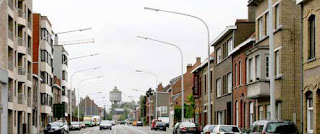
Image 2

Second Life Prims

Second Life Image

In class we made Second Life accounts and experimented in the virtual world. One class we each created our own prims. I chose to create a cylinder. I adjusted the dimensions to my liking. I then chose to add a texture. In the fabrics folder I found a zebra print patter. I applied this to my cylinder and then added a purple overlay (JMU pride!). Then I duplicated the cylinder. I edited this new cylinder by adding a water texture to it. I thought this was a really cool effect because it is aesthetically pleasing and interesting because the cylinder is transparent like water.

Thursday, February 24, 2011

Gestalt Principles and Icons

Exercise 1
Gestalt Principles
Gestalt principles include closure, proximity, similarity, and continuity. I chose to create a representation of closure. The concept of closure refers to the fact that we tend to spontaneously attach meaning to visuals. When viewing an image our mind automatically tries to make connections between the different aspects of the composition. Shown below is my composition showing the concept closure.
Closure
To create this image I used Adobe Photoshop. I used the shape tool to draw two rectangles and a heart. I then filled the heart in with white. I placed the two rectangles parallel to each other and then put the heart on top of the two. If you break the image up you see a black rectangular shape with two half circles missing from the bottom and another rectangular shape with an upside down Hershey kiss shape missing from the top. When we view the image as a whole our mind connects the two half circles Hershey kiss to make a heart. We know that if we were to close in on the white space by drawing lines on each side connecting the black missing from each shape it would, indeed for a heart. The main point of this concept is that even though there is not a heart outlined, we still clearly see it because we draw the shape in our minds.

Exercise 2
Icons
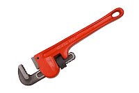
Krause says "The ultimate goal of an icon is to convey a message--quickly, clearly and in a manner that is aesthetically appropriate for its purpose and target-audience" (155). The assignment for this concept was to find an image of an object and create an icon out of it. I chose a the wrench featured below.
Original Image
I decided to create my composition using Adobe Photoshop. First, I selected the top portion of the wrench. I then dragged this piece of the wrench into a new canvas. I used the shape tool to draw a black square on the layer under the wrench. While the black square layer was selected, I traced the outline and detail lines on the wrench. After finishing drawing the wrench, I deleted the layer with the actual image on it. I used the paint bucket tool to color in the drawing. Finally I used the crop tool so that there was little black space around the image and then rotated it.
Icon
The final product came out as planned. The icon is simple but to the point. It is easy to tell what  image was used to create the composition. The three different colors go well together causing the icon to be appealing to the eye. Although the icon may not seem "pretty", it is using an image of a tool meaning it is most likely geared towards men. 

Tuesday, February 22, 2011

Composition: Critical Reflection

Connection
          All elements are that are connected are placed in association with each other visually. I also made sure to use phrases such as “below is my original image”, in order to connect the descriptions with the correct corresponding image. The images are also placed in order of stages. For example, in the Color and Emphasis post, I included the original image and two drafts of my work. I started by posting the original image with a description of the exercise. Then I posted my first draft of work with a description, followed by my second draft of work that included extra elements to make it look more finished with a description. I believe no changes are necessary because all the images posted are clearly connected with their corresponding descriptions. The narratives seem to flow as well. Each description is linking to the next. Words such as “also”, “then”, and  “next”, ensure this flow. Each post is titled, as well as each exercise. This allows the reader to understand where one concept ends and another begins. This creates visual breaks to show division between posts as well. Although each concept is separated from the other, the structure of each post is similar creating a sense of unity throughout the piece.

Alignment
          Although alignment is not consistent throughout the portfolio, each post consists of a pattern allowing it to be aesthetically pleasing. For example, in the Grouping and Theme post, each image is staggered. The first image is on the left with its corresponding description on the right, the second image is on the right with its corresponding description on the left, and so on. I believe strategies such as staggering minimize the amount of blank space in the portfolio, making the flow a lot better. However, there are some open spaces remaining on the portfolio in order to ensure that it does not look too busy.

Priority
          The portfolio itself is very pleasing to the eye. Colors such as light pink, magenta, and gray are used. These colors all go together nicely causing a pleasing visual flow. Different colors are used for each element of the portfolio such as background, body text, post title, and blog title. This shows contrast between each element and keeps them from being clumped together. The title of the portfolio itself is written in very large text, while the title of each post is bolded but not as large, and the body text of each post is written fairly smaller and not in bold. This causes a clear hierarchy between the elements. The light pink of the background allows each image to be seen easily without distraction. The side panels of the portfolio have a soft ethereal design that fades into a solid magenta. This effect allows the viewers focus to remain on each composition rather than being directed off the page. 

Krause Color and Emphasis

Exercise 1
Warm Up

As a warm up exercise in class we were told to take one simple image and make several copies of it. I decided to use Adobe Photoshop for this warm up. I chose the image of the heel because it is simple and easy to lasso using the magnetic lasso tool. I then opened a new document and dragged several copies of the shoe into it.
Original Image
Draft 1

In my first draft I used five copies of the shoe. I placed them in a straight line. I then used the color overlay tool to place a black overlay over four of the shoes. This placed a greater emphasis on the remaining bright pink shoe.


Draft 2

In my second draft I decided to use the image adjustment tool. I used four shoes in a line this time. I selected one shoe and changed the adjustment to black and white. This created an emphasis on the one uncolored shoe. Although the remaining three shoes are bright pink and may usually catch the eye, now that the black and white shoe is the "odd one out" the eye is directed towards it. Finally, I used the rectangle too to add a finishing touch to the image. I made one rectangle a gray color and another a bright pink color.

I feel that my drafts both effectively show how color can be used to create emphasis. In both images one shoe differs from the rest, causing it to stand out from the others. Krause says "If everyone shouts, how will any one voice be heard?" (63). This is an interesting concept to keep in mind. It is important to make your work easy on the eyes by showing exactly what you what emphasized. Color helps you do this.

Exercise 2
Past and Present
For this exercise I chose an image of a street in Hong Kong. The assignment was to select one object in the scene and make it stand out from the rest of the photo. Below is my original image.
Original Image
My Final Product
First, I used the polygonal lasso tool to select the double decker trolley. I then inverted the selection and used the adjustment tool to make the rest of the image black and white.  Now, the double decker trolley is vibrantly in color, while the rest of the image is black and white. This exercise is called past and present because the black and white effect causes the image to look old, while the vibrant colored trolley looks very modern. I chose the trolley because it shows innovation and technology. I believe my image is a good representation of how black and white versus color can show emphasis and connect to larger themes such as changes through the times.


Thursday, February 10, 2011

Krause Alignment Exercise

Exercise 1
Alignment
Krause calls alignment a compositions “structural framework” (79). The exercise was to create an advertisement for an imaginary company. I chose to use an image of bright pink high heel shoes. I imported the image into a powerpoint document. I then centered the image at the top of the slide. I chose to use two simple, yet strong, words to describe the shoes. I added a text box and wrote “Fearless” and “Fabulous”. I then changed the fonts to make it look more aesthetically pleasing. I then set it to space out the letters in the word “Fabulous” so that it would be aligned with “Fearless”. I also added the company name, “Allard Heels Inc.” and “Established 2010” at the bottom of the slide. I made sure to keep the font small so that it would not take the focus away from the image or its caption. Finally, I added a gradient to the background to make the advertisement more catchy. I made sure that the darker part was behind the image and caption, again, to keep the focus on that portion of the image. When looking at my final product and comparing it with examples presented by Krause, I wish that I would have done something a little more edgy. I feel my advertisement utilizes the concept of alignment but it is very simple, and safe

Wednesday, February 2, 2011

Krause Grouping and Themes


Exercise 1
Grouping and Theme
In this activity we were told to arrange shapes on seven different power point slides. The point of this exercise was to use concepts of grouping in order to convey different themes. For this activity I used the shape tool to draw the various shapes, the formatting palette to change the colors, and Wordart to write the themes.

One theme is anarchy. Synonyms of anarchy include: lawlessness, chaos, disorganization, and disorder. On my slide I drew ten "talk bubbles". I then placed the shapes randomly around the edge of the slide. The array of mismatch colors and placement shows disorganization and chaos. The fact that the shapes are partly off the edge of the slide implies that they are unrestrained, showing lawlessness and disorder.

The next theme is celebration. Synonyms of celebration include: jubilee, honoring, recognition, and party. On this slide I used stars as the shapes to represent honor and recognition. I colored them bright yellow in order to show jubilee. I arranged the stars in a circle, overlapping each other to symbolize the crowdedness of a party.

Another theme is escape. Synonyms include: departure, bolt, getaway, and leave. I used arrows on this slide and put them all in a path leaving the slide. This image clearly represents all the synonyms listed above. I also used the color red on the slide to represent the red light in "Exit" signs.

The next theme is intimidation. Synonyms of intimidation include: coercion, frightening, and threatening. I used the starburst shape because it seemed to best represent a threatening shape. Nine of them are grouped and have coerced the one white shape into a corner. I also used the color red to symbolize anger.

Isolation is the next theme. Synonyms include: withdrawal, segregation, and solitude. I used nine arrows pointing one direction to simulate a group and one lone arrow pointing in the opposite direction to simulate an isolated being. The isolated arrow shows solitude. The group moving away shows segregation, while the arrow moving away from the group shows withdrawal.
Another theme is logic. Synonyms of logic are: coherence, relationship, and sense. I used addition signs because mathematics is known as a logical or sensible field. I filled five with white and four with green. I separated the two colors into separate lines. I did this to show coherence and relationship between the shapes with the same color.

Unity is the next theme. Synonyms include: alliance, harmony, and peace. I used smiley faces to symbolize harmony. I colored them a calm greyish blue to show peace. I then arranged the smiley faces into a circle to represent alliance.


This concept is helpful in designing business cards, posters, websites, etc. Krause says "Visual grouping aids discovery by helping the viewer make useful connections between elements" (41).  In other words, the arrangement of objects on a page can help establish and/or reinforce the meaning being conveyed. Overall I feel that my slides effectively represent each theme.

Monday, January 31, 2011

Krause Horizon Variations and Golden Section

Exercise 1
Point Placement
The first exercise was to use the Principle of Unequal Spacing to place points on a piece of graph paper. Krause says to use this principle and apply it to “points-of-interest” in later compositions. Placing various focal points in random spaces of compositions ensures that the work will be more pleasing to the eye.

Exercise 2
Horizon Variations
The second exercise dealt with cropping photos in order to alter the positioning of the horizon. Krause says to avoid centering the horizon line in an image unless it is for a certain reason.

In the first original image, there is a lot going on with the cars, trees, and telephone poles. We were told to crop the photo in order to draw a stronger focus on the road as opposed to the sky. 
Original Image 1
The image below is my edited version of the horizon photo. I used the crop tool in order to cut out as much of the sky as possible. I tried to cut off some of the tops of the telephone poles. I also made sure to follow Krause’s advice by placing the horizon higher rather than in the center of the image.
Focus on Road
In the second original image, the horizon is placed directly in the center of the image and the intended focus is unclear.
Original Image 2
The image below is my edited version of the second horizon photo. I used the crop tool in order to place more of a focus on the skyline. I also cut out a piece of the buildings on the left because I found the ones on the right to be more aesthetically pleasing.
Focus on Sky
I believe that my cropped images are much more pleasing to the eye and effectively show how the focus of an image may be changed using the crop tool.

Exercise 3 
Golden Section Ruler


Krause explains the Golden Section as “an aesthetically pleasing division of space that is often used by artists as the basis for measurements within their compositions” (34). To the left is my Golden Section Ruler. I created a new canvas in Photoshop and then using the rectangle tool I drew a 13” long. I then divided the ruler in two sections, one 8” and one 5”. I separated the two by using the paint bucket tool and coloring one purple and the other pink. I will be able to insert this ruler into Photoshop as a layer in order to determine where to place focal points in future compositions.

Wednesday, January 19, 2011

Google Earth & Geospatial Projects Event

Mapping Historical Resources, Harrisonburg, VA, Kevin Borg, History Dept.
Professor Borg began by passing around a map of Harrisonburg. The representational graphic allowed the audience to see the types of maps Borg and his students worked with. Borg and his students scanned sections of maps drawn in 1912. Borg then used Google Earth Pro to piece together the maps of 1912. He then overlapped this now complete map on top of the Google Earth images of Harrisonburg. This allows students and citizens of Harrisonburg to compare what the town used to consist of versus what it consists of today. The visuals were very helpful. The images of Harrisonburg today were very recognizable because they were full colored pictures. It was difficult to truly picture what Harrisonburg looked like in 1912 because it was only represented by line drawings that mapped out infrastructures of the town. However, Borg did mention that he hoped to receive grant money that would allow him access to colored images of Harrisonburg in 1912. The visuals Borg used helped change the audiences perspective of the subject because people do not often walk around a town thinking of what it used to look like. Instead, we only focus on today. It was interesting to see into the past of Harrisonburg and to realize how it has developed. The graphics were presented using a projector and screen. This equipment may have effected the images due to the screen resolution and how many pixels the projector lens presents. Borg did a good job of expressing how the process was for him and his students and made it possible for the audience to understand the struggles the students went through without actually hearing from them. Borg used a few terms that I was not aware of before this presentation. First, I learned that "Art GIS" is a map making program. Then, I learned the technique "rubber sheeting", where one looks for anything that exists on maps now that had also existed in the past (as in 1912). Also, I learned that "geotips" are tip files that have the location (longitude and latitude) embedded in them.


Interactive Geologic Maps of Virginia and the Shenandoah Valley Region, Steve Whitmeyer, Geology & Environmental Science Dept.
Steve Whitmeyer used representational graphics to discuss the geological make up of Virginia. He used Google Earth  Pro to show the audience maps, cross sections, and actual photographs of the different types of rocks that make up the land in the Virginia area. Whitmeyer said that he hoped to create a geological template for Virginia and, if successful, would use the template for other areas of the world as well. He aimed to help citizens have a better understanding of the regional development of Virginia as a whole. This presentation seemed to be more technical and was mostly aimed towards those with a general understanding of geology. It was helpful that Whitmeyer used several different types of graphics. He did the presentation in layers. Whitmeyer began by showing an image of Virginia. He then zoomed in and the map separated the different regions of Virginia into different colors. As he zoomed closer and closer the images became more detailed. They started to show the types of rocks in the region and the different elevations of the land. Whitmeyer had also embedded links to photos of different areas to help the audience picture exactly what area was being discussed. Whitmeyer used a projector and screen. The equipment may have affected the image clarity due to the screen resolution and number of pixels the projector lens presented. It would have been helpful to see images of other geological maps to compare the similarities and differences between them and Whitmeyer's. It was difficult to follow this presentation at points because I am unaware of geological terms. Whitmeyer did not express why this template would be helpful to citizens of Harrisonburg and/or Virginia as a whole.