Gestalt Principles
Gestalt principles include closure, proximity, similarity, and continuity. I chose to create a representation of closure. The concept of closure refers to the fact that we tend to spontaneously attach meaning to visuals. When viewing an image our mind automatically tries to make connections between the different aspects of the composition. Shown below is my composition showing the concept closure.
 |
| Closure |
To create this image I used Adobe Photoshop. I used the shape tool to draw two rectangles and a heart. I then filled the heart in with white. I placed the two rectangles parallel to each other and then put the heart on top of the two. If you break the image up you see a black rectangular shape with two half circles missing from the bottom and another rectangular shape with an upside down Hershey kiss shape missing from the top. When we view the image as a whole our mind connects the two half circles Hershey kiss to make a heart. We know that if we were to close in on the white space by drawing lines on each side connecting the black missing from each shape it would, indeed for a heart. The main point of this concept is that even though there is not a heart outlined, we still clearly see it because we draw the shape in our minds.
Exercise 2
Icons
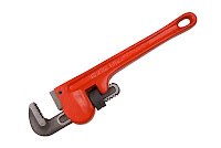
Krause says "The ultimate goal of an icon is to convey a message--quickly, clearly and in a manner that is aesthetically appropriate for its purpose and target-audience" (155). The assignment for this concept was to find an image of an object and create an icon out of it. I chose a the wrench featured below.
 |
| Original Image |
I decided to create my composition using Adobe Photoshop. First, I selected the top portion of the wrench. I then dragged this piece of the wrench into a new canvas. I used the shape tool to draw a black square on the layer under the wrench. While the black square layer was selected, I traced the outline and detail lines on the wrench. After finishing drawing the wrench, I deleted the layer with the actual image on it. I used the paint bucket tool to color in the drawing. Finally I used the crop tool so that there was little black space around the image and then rotated it.
| Icon |
No comments:
Post a Comment